Back to works
Product & UXProject
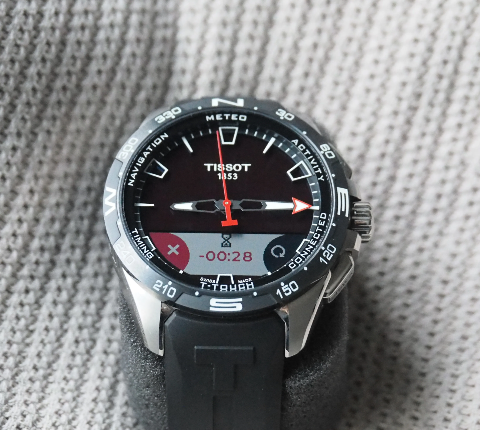
Tissot T-Touch Connect : Localisation, Fitness & Wearable Design
UX design and localization strategy for Tissot's first connected smartwatch, shipped across APAC markets under strict hardware and CJK typography constraints.
Overview
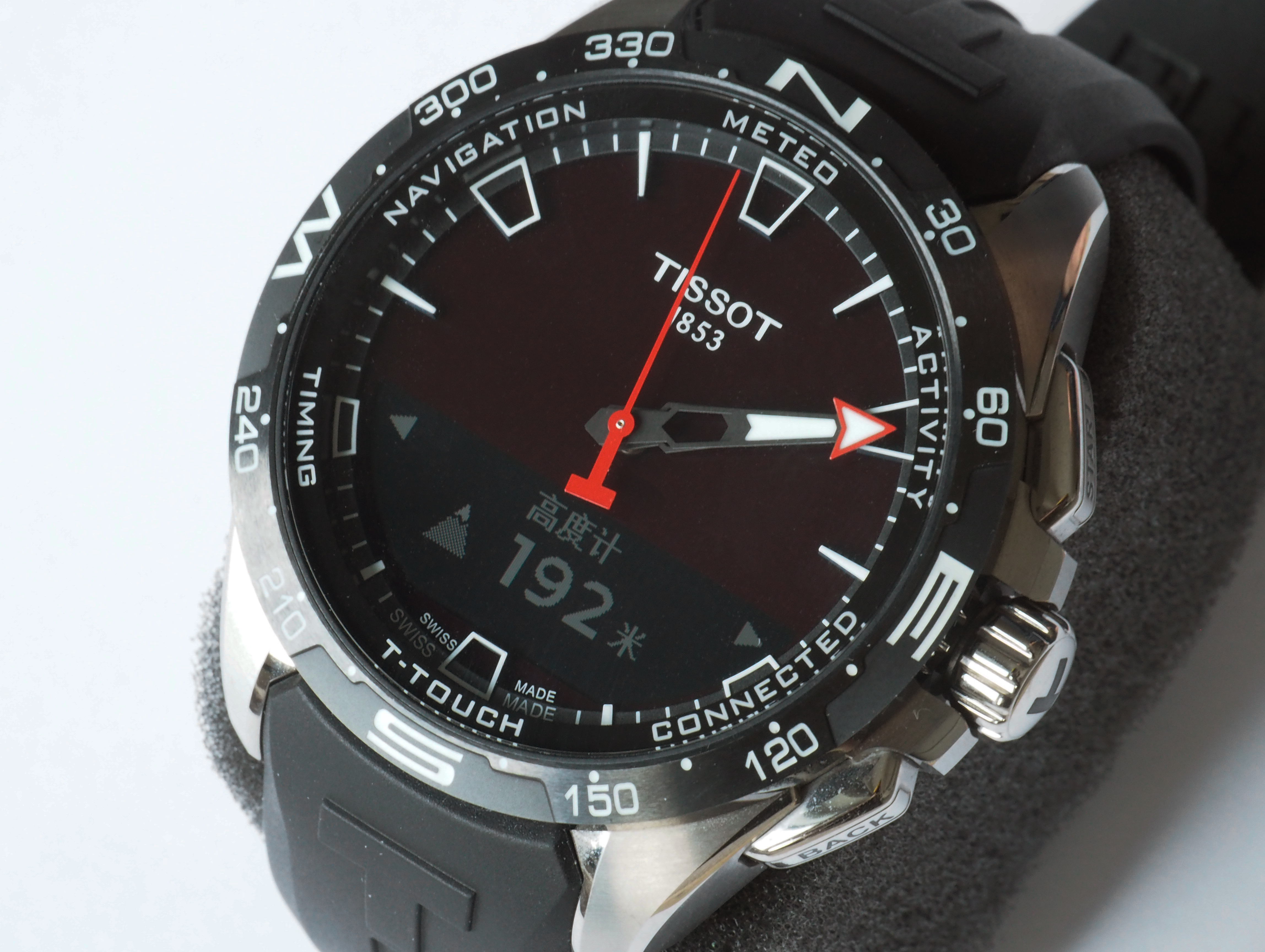
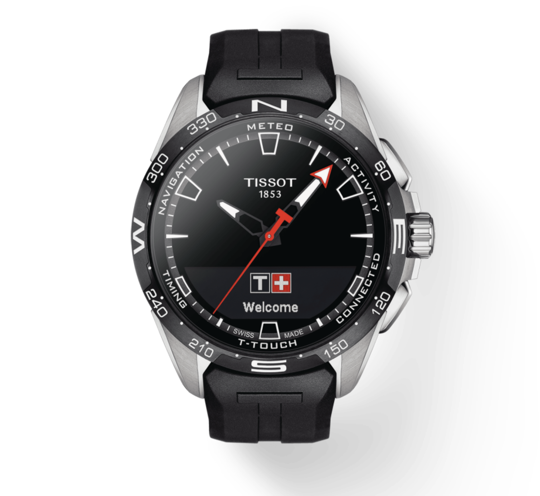
Tissot's T-Touch Connect Solar was the brand's first connected semi-smartwatch, built on Huawei's Sports and Health ecosystem. As the product entering market preparation for APAC launch, it faced critical UX challenges: an immature health and fitness experience, severe localization gaps for CJK languages, and strict hardware constraints that threatened daily usability.
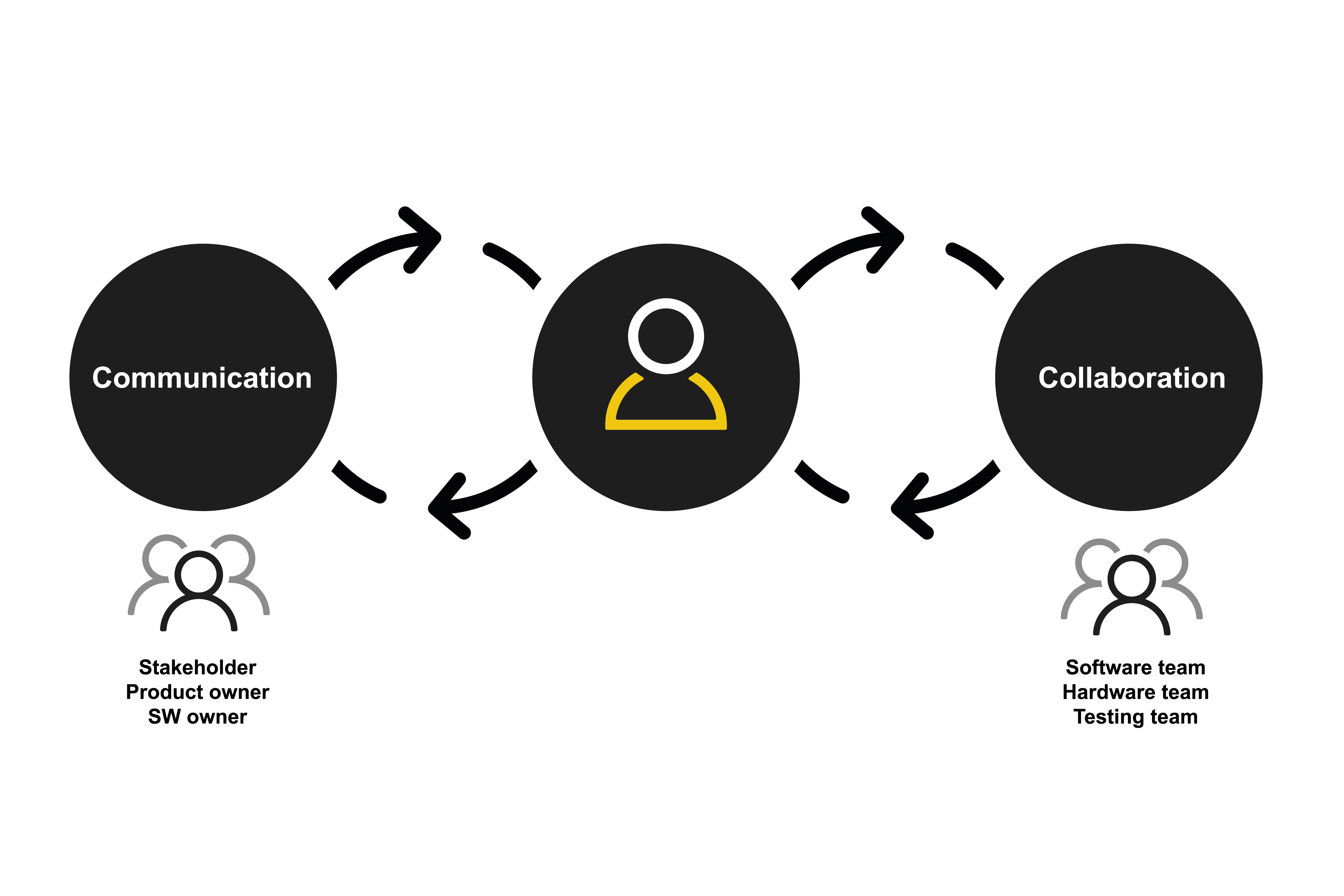
As the sole UX designer on a cross-functional team spanning product, software, hardware, and testing, I led the end-to-end experience redesign: from information architecture and interaction flow design, to localization strategy and typography engineering, to deliver a watch that was not just technically functional, but genuinely useful in daily life.
The Challenge
What was at stake?
Tissot needed to launch a competitive connected watch in APAC markets by late 2020, but the product faced major usability risks:
- Unclear feature hierarchy: Health and fitness functions lacked prioritization, making core tasks hard to discover or complete.
- Localization gaps: Critical gaps in CJK (Chinese, Japanese, Korean) language support threatened readability and market viability.
- Notification chaos: On a low-resolution, tactile screen, notifications were difficult to parse quickly.
- Severe hardware limits: Memory and rendering constraints made full Unicode CJK support impossible, requiring creative technical solutions.
The core question: How do we make this watch useful in daily life, not just feature-complete on paper?
Goals
- Redesign and prioritize core health and fitness experiences for MVP+ launch
- Deliver high-quality localization for key APAC markets (especially CJK languages)
- Improve connected features—especially notifications—for clarity and speed
- Ship on time for late 2020 rollout
Approach
I ran a phased UX process balancing research rigor with engineering feasibility:
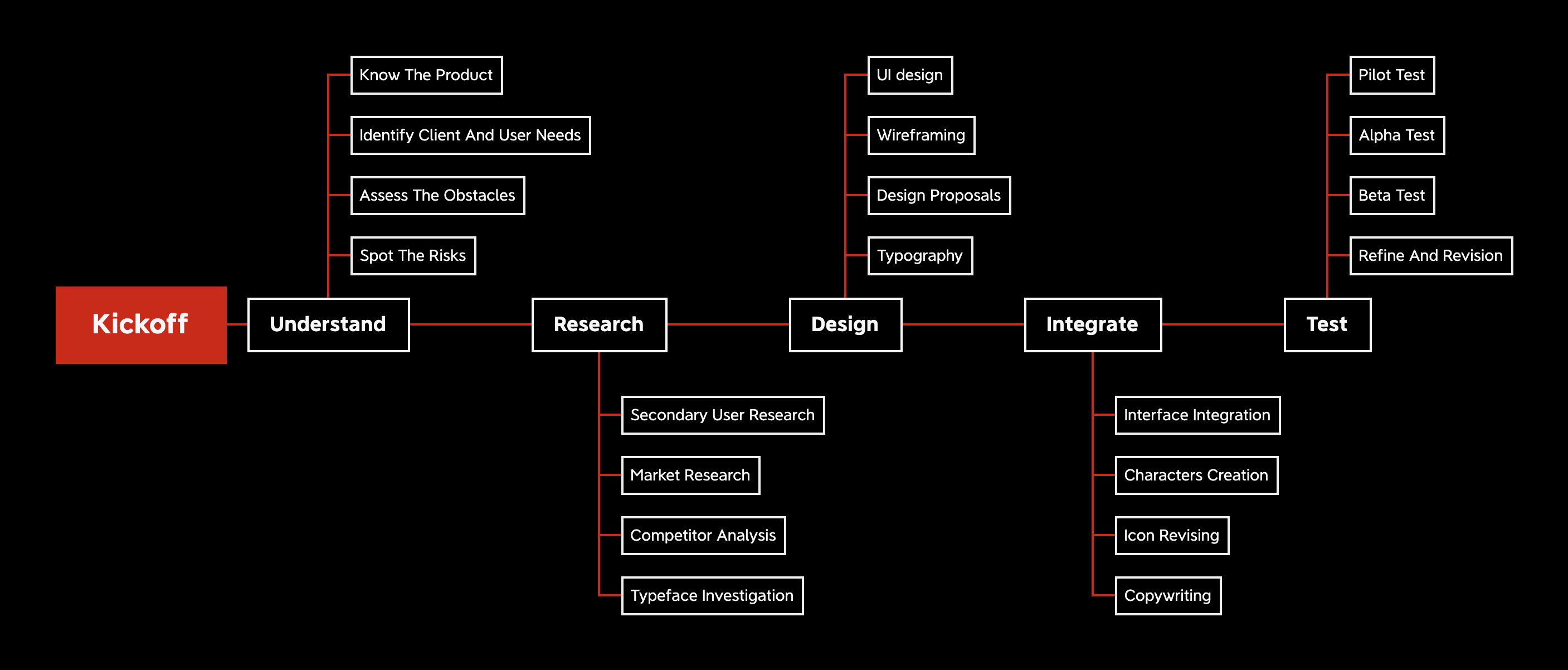
1. Understand
Product audit, identified critical usability gaps and technical constraints
2. Research
Mix-method research, competitor analysis, typeface investigation
3. Design
Iterative process, 10+ design cycles across ~200 screens
4. Integrate & Support
Active collaboration with engineering to ensure UX quality through dev and testing
As the only UX lead, I coordinated decisions across Tissot (business, product, hardware) and Huawei (software, hardware, testing) teams to keep quality aligned with delivery constraints.
Key Workstreams
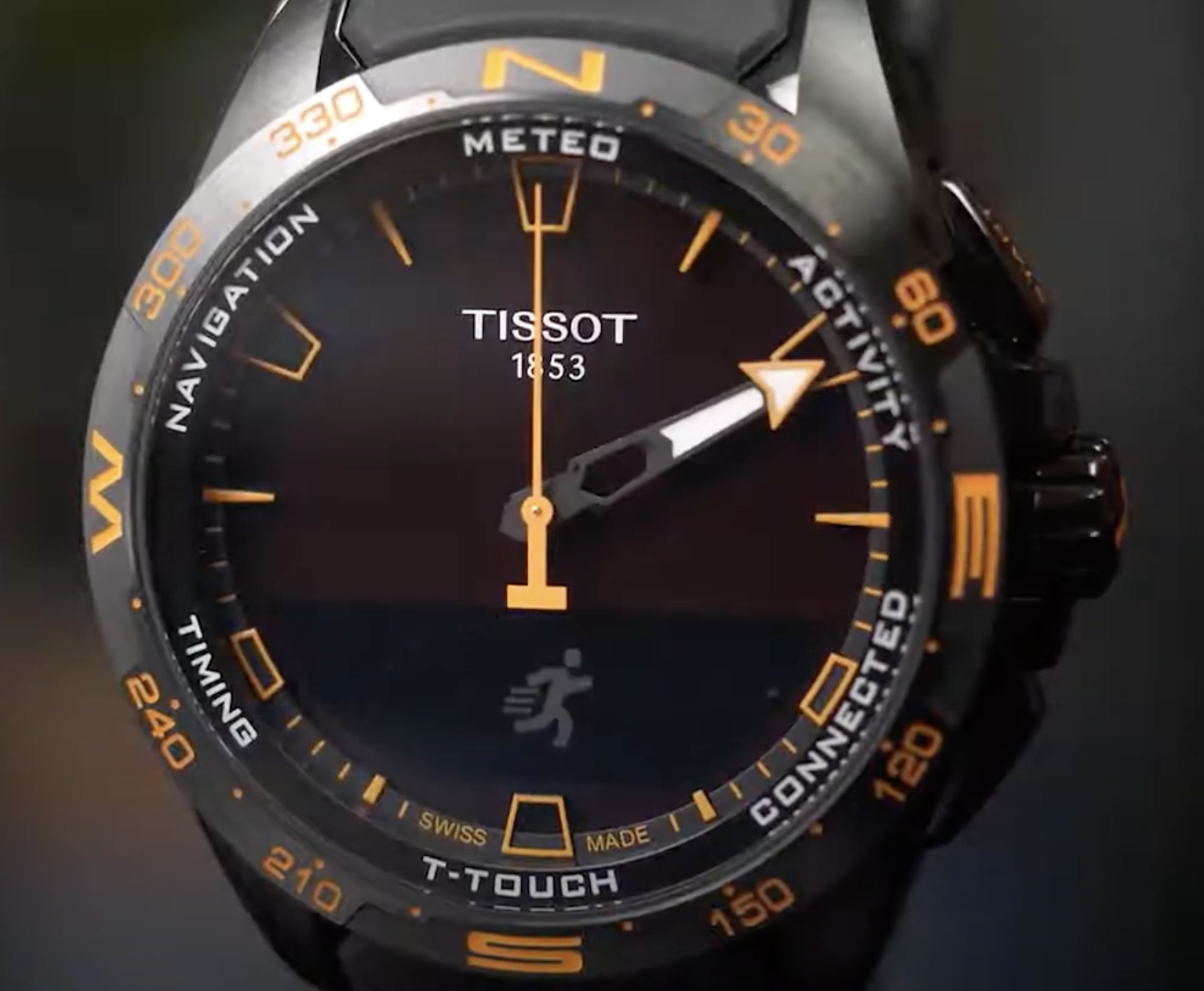
1. Information Architecture & Interaction Design
Challenge: The original feature set was bloated and poorly organized. Users couldn't quickly access health data or complete common tasks.
What I did:
- Mapped user journeys for core health and fitness scenarios (activity tracking, heart rate monitoring, workout summaries)
- Redesigned navigation hierarchy to surface high-frequency actions
- Refined tap targets and interaction flows for the tactile interface, ensuring clarity under varied lighting conditions
Impact: Clearer pathways to key features; faster task completion in daily use.
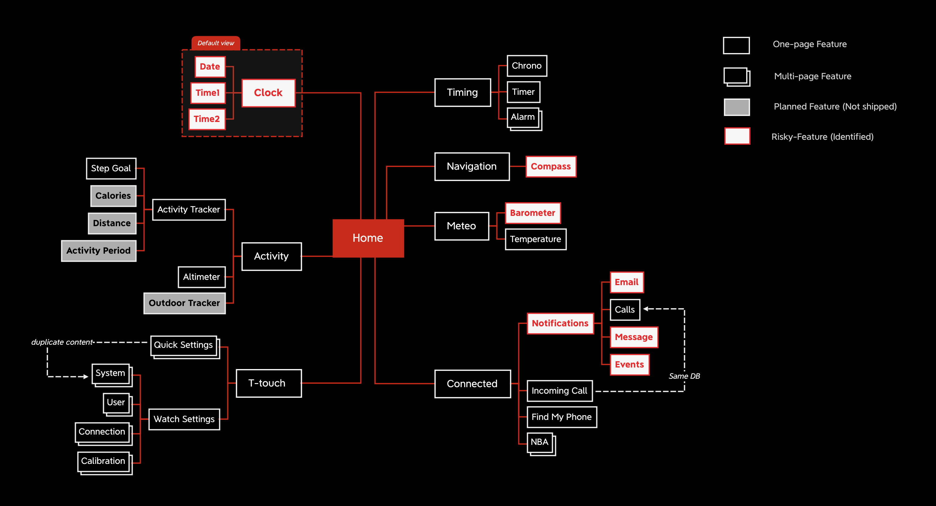
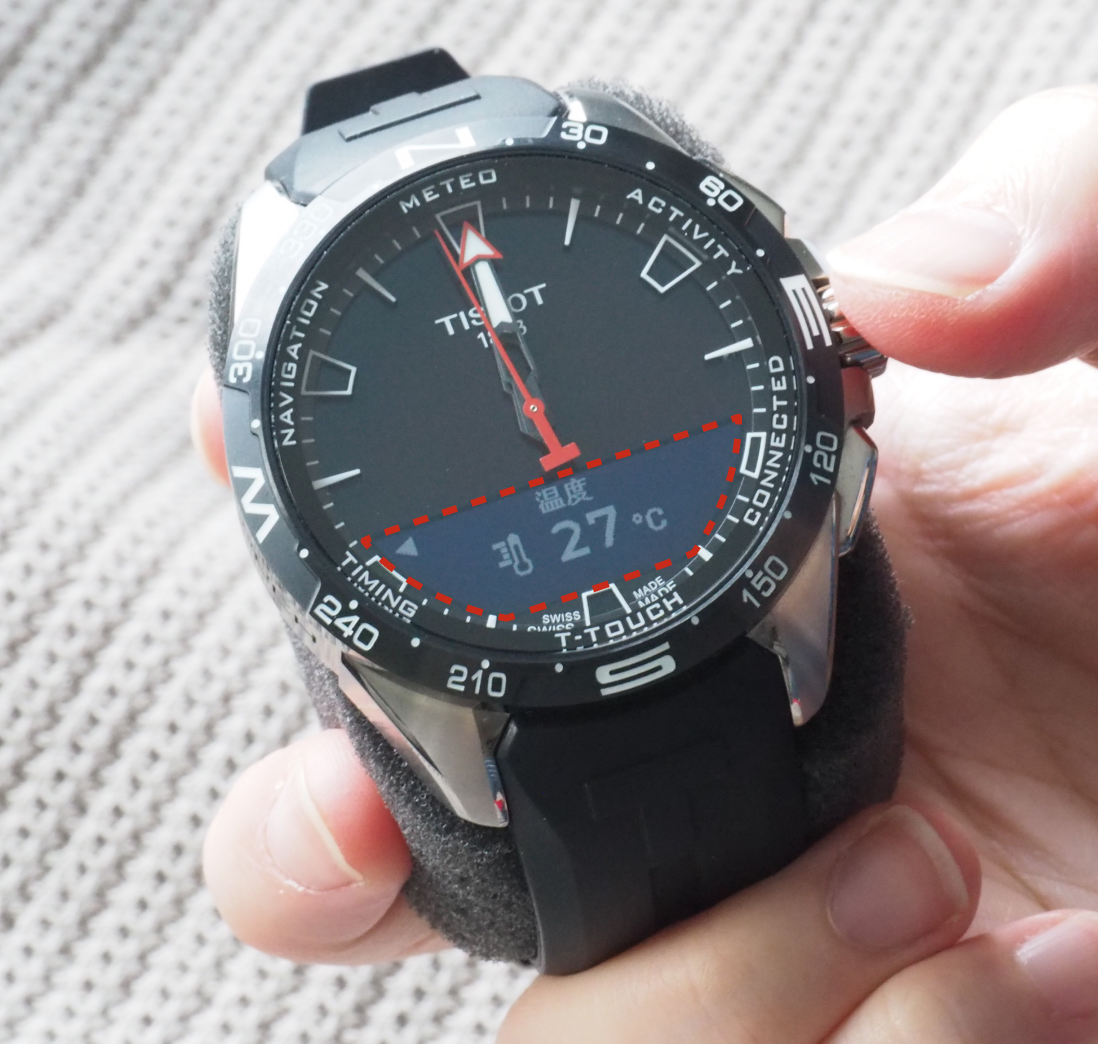
2. Notification Redesign
Challenge: Notifications were cluttered, slow to parse, and didn't respect the constraints of a tiny, low-res display.
What I did:
- Re-architected notification layout for faster scanning and comprehension
- Prioritized message hierarchy (sender → preview → action)
- Designed fallback states for truncated or missing content
Impact: Users could glance at notifications and make decisions without needing to pull out their phone.
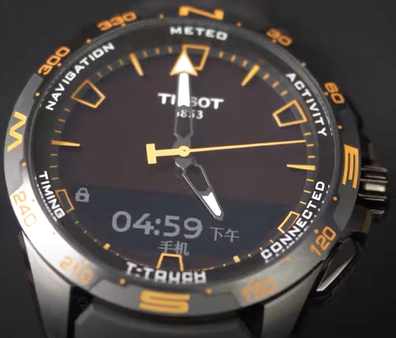
3. Localization Strategy
Localization was the most complex and critical workstream, involving cultural, linguistic, and technical challenges across multiple APAC markets.
Cultural & Linguistic Adaptation
- Conducted market-specific research to align content with local health/fitness terminology, date/time formats, and measurement preferences
- Reviewed all UI strings for cultural appropriateness, tone, and context—especially for health messaging where nuance matters
- Collaborated with regional stakeholders to validate translations for Simplified Chinese, Traditional Chinese, Japanese, and Korean
Typography Strategy
The problem: Full CJK Unicode support would require ~70,000+ glyphs, far exceeding the watch's firmware memory limits.
My solution:
- Designed a core daily-use character library of ~20,000 high-frequency glyphs, based on linguistic frequency data and product-specific vocabulary
- Manually inspected and optimized glyph rendering at tiny screen resolutions
- Partnered with engineering to implement a custom font subsetting and bitmap rendering pipeline that preserved clarity while fitting memory constraints
Impact: Users could read notifications, activity summaries, and health data without truncation or missing characters—balancing readability, cultural usability, and firmware performance.

Testing & Validation
- Ran localization QA sessions with native speakers using actual watch hardware to catch edge cases (long strings, compound words, truncation)
- Testing legibility and readability on physical hardware under varied lighting
- Iterated on text hierarchy and spacing to improve scannability on the small display
Outcomes
The product shipped on schedule in late 2020, with the China launch completed in November 2020.
- Clearer notification flows: Users could parse messages at a glance
- Improved localized readability: High-quality CJK support within strict memory limits
- Stronger cross-market usability: Design held up under hardware constraints across APAC markets
Public sales data was not disclosed, so commercial impact is not included here.
Key Decisions
- Prioritized "daily-use clarity" over feature density — ruthlessly cutting or simplifying low-value functions
- Re-architected notification UX for faster comprehension, respecting screen and memory limits
- Chose constrained CJK glyph set + manual quality tuning to fit memory without sacrificing usability
- Embedded UX into integration/testing rather than treating it as a final polish step
Learnings
Designing for wearables requires ruthless prioritization: every pixel, glyph, and interaction state must earn its place.
Strong UX outcomes came from combining research rigor with technical feasibility—especially when localization and hardware constraints collided.
Working as the sole UX lead taught me to balance design advocacy with pragmatic trade-offs, keeping quality high while respecting engineering and business realities.
References
Tools & Methods
LocalisationGTMUX ResearchUI DesignPrototypeJiraSketchConfluenceMS OfficeAdobe Photoshop
Let's talk
Working on something complex?
Good judgment, real problem, difficult environment — I'd like to hear about it.