Smart Symptom Check: Strategic UX in Regulated Healthcare
Product strategy and UX consultancy for an MDR-certified symptom assessment platform, delivering a core workflow upgrade in under two months with zero negative post-release feedback.
Overview
Smart Symptom Check is a B2B2C symptom assessment Software-as-a-service (SaaS) platform used by healthcare organizations across Europe to streamline clinical intake and triage. As a regulated medical device (MDR-certified), it operates at the intersection of clinical accuracy, regulatory compliance, and user experience, where poor design choices can create safety risks and adoption barriers.
This case study explores how I helped the team break through a critical strategic deadlock, ship their largest post-MVP upgrade in under 2 months, and build sustainable patterns for validating and delivering UX improvements in a regulated healthcare environment.
The Challenge
Smart Symptom Check provides clinical intake and triage tools for healthcare organizations across Europe. Despite strong clinical intent, the product faced critical UX and strategic challenges:
Usability Friction
- High-effort workflows for daily professional use
- Inconsistent UI patterns across modules
- Critical accessibility gaps (keyboard navigation, screen reader support)
Strategic Uncertainty
- Feature decisions driven by industry hype (e.g., "add AI now")
- Long internal debates delaying high-impact improvements
- Unclear prioritization framework
My Approach
I established a continuous discovery-and-delivery loop that balanced user needs with regulatory constraints:
1. Understand
- Audited existing journeys and failure points
- Interviewed clinicians, patients, and internal stakeholders
- Mapped regulatory requirements to UX decisions
2. Align
- Created shared decision criteria across product, clinical, and regulatory teams
- Prioritized based on user impact and compliance risk
3. Validate
- Tested risky choices early with representative healthcare users
- Used interactive prototypes to reveal cognitive load issues
4. Deliver
- Translated insights into Jira-ready requirements
- Built reusable design system for consistency
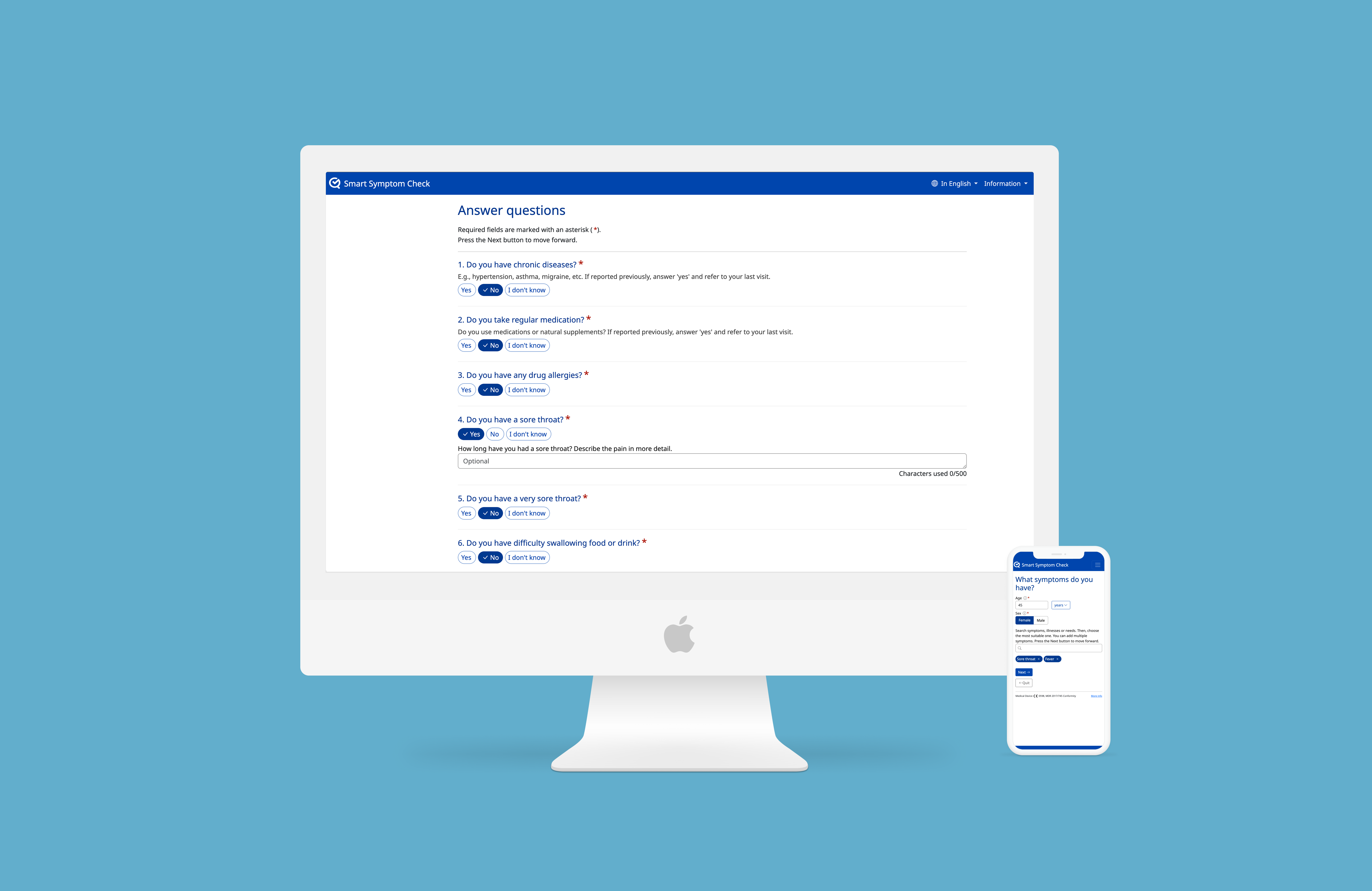
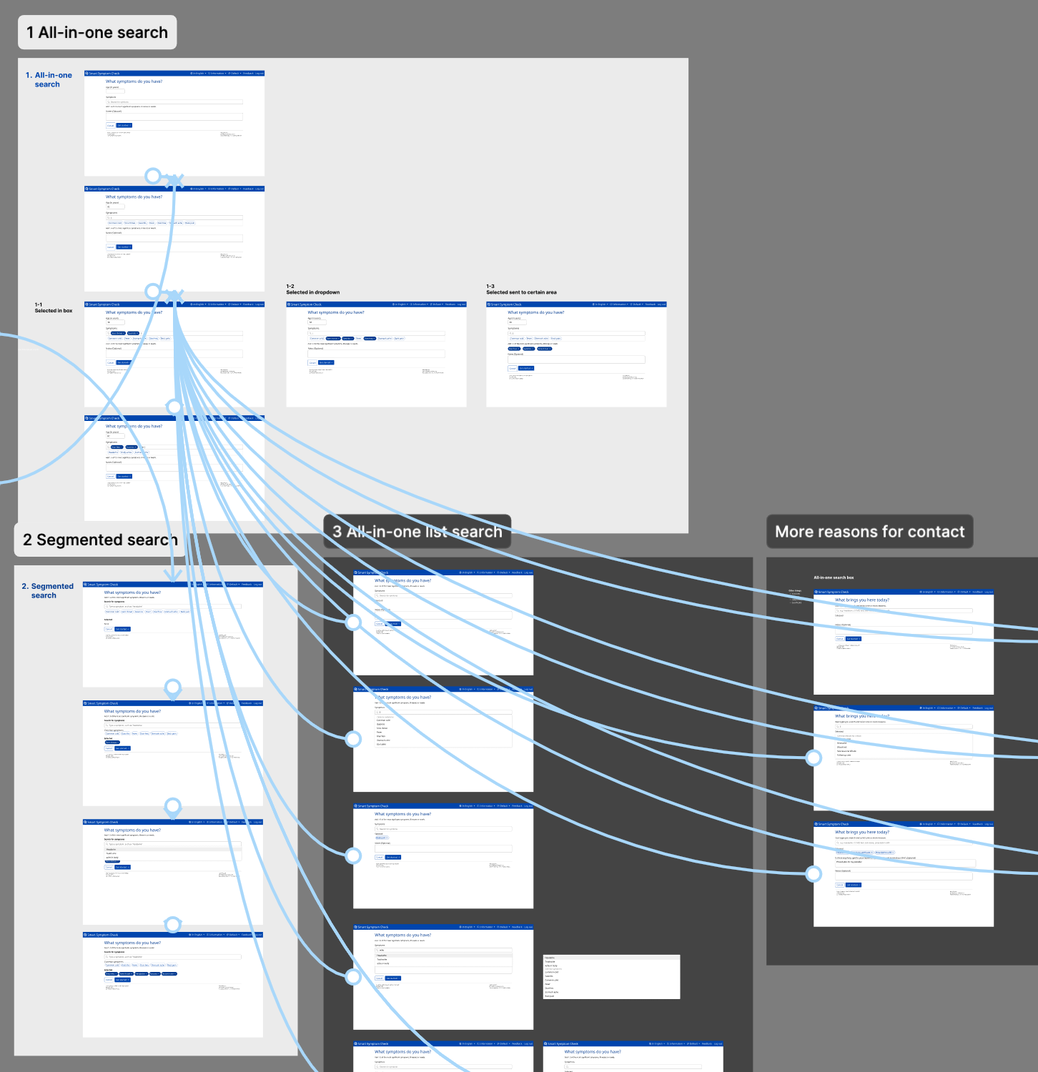
Usability and Accessibility Redesign
The Problem
The existing interface had accumulated usability debt across multiple releases. Healthcare professionals faced inconsistent UI patterns, inefficient workflows, and critical accessibility gaps that made the product difficult to use for users with disabilities. As a regulated medical device, these issues posed both adoption risks and compliance concerns.
The Approach
I led a comprehensive redesign effort that addressed:
- Accessibility compliance: Implemented WCAG 2.1 AA standards, including full keyboard navigation, screen reader support, and improved color contrast
- Workflow optimization: Streamlined high-frequency clinical tasks to reduce cognitive load and interaction steps
- Design system foundation: Created reusable component patterns to ensure consistency across all modules
- Regulatory alignment: Ensured all UX decisions met MDR requirements and ISO 62366 usability engineering standards
The Outcome
The redesign delivered measurable improvements in both compliance and user experience. The product achieved full accessibility certification, healthcare professionals reported smoother daily workflows, and the design system enabled faster, more consistent feature development going forward. Most importantly, the work established UX quality as a core product requirement, not an afterthought.
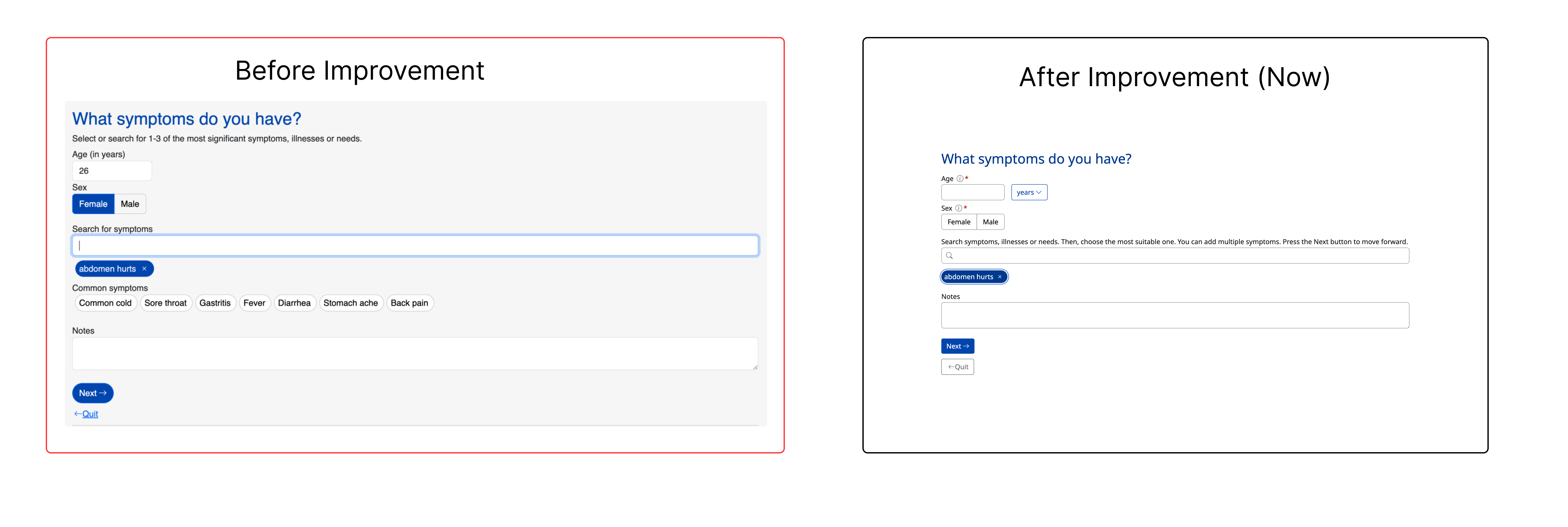
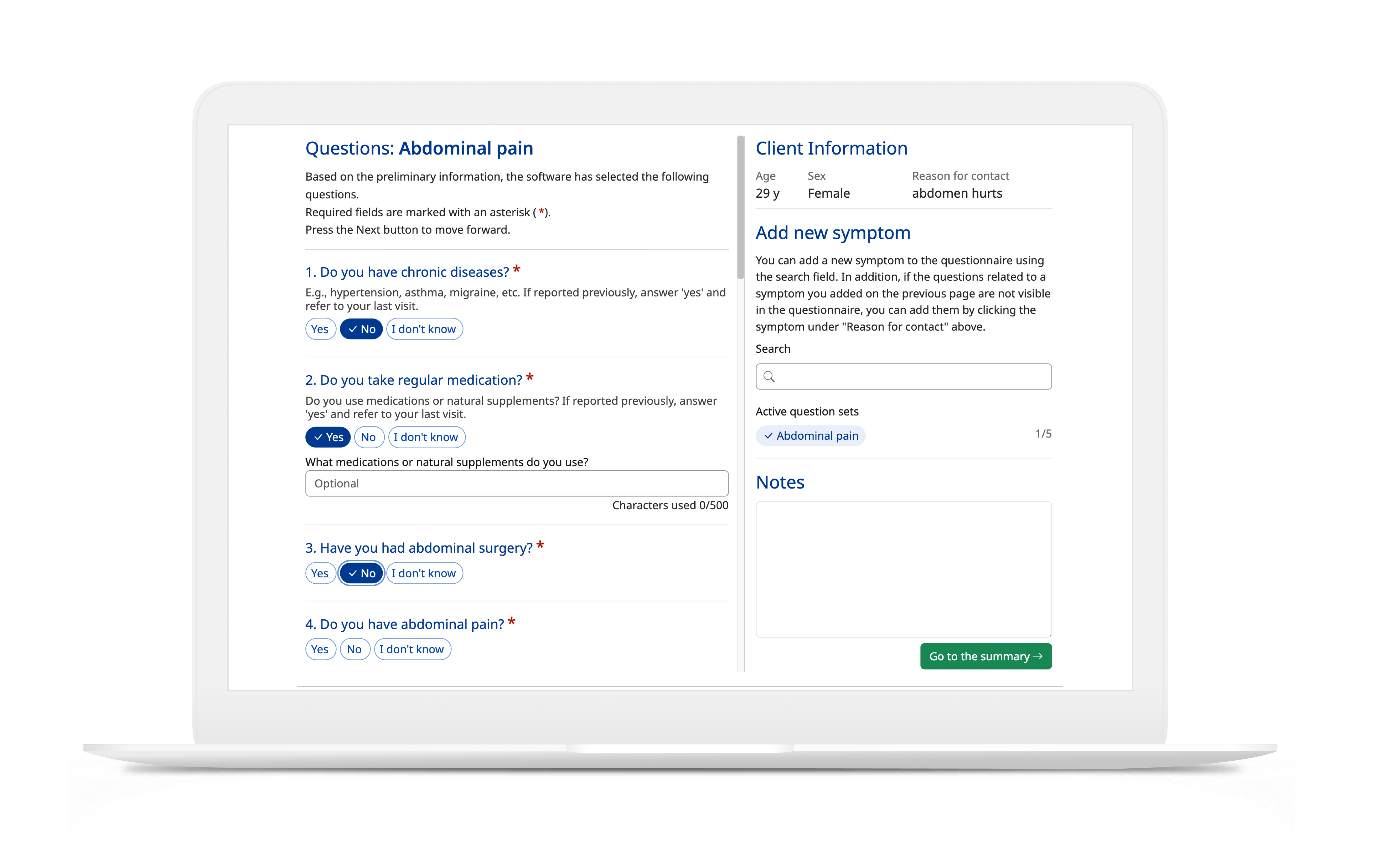
Core Workflow Upgrade Through Rapid User Validation
The Situation
A critical high-usage workflow needed an urgent upgrade. Nurses were struggling with the current interface—when taking phone calls from patients and filling in questionnaires on their behalf, they had to constantly switch between screens and re-enter context. The team had brainstormed multiple competing concepts, but no clear path forward. Engineering needed a decision to meet the release window, yet stakeholders remained stuck in opinion-driven debate.
The Stakes
- Missed release window that would delay value to partner clinics
- Risk of over-engineering a complex solution without user validation
- Potential for costly post-launch rework if we got it wrong
- Growing stakeholder frustration and team misalignment
My Solution
Evidence-First, Minimum-Risk Path
I proposed a structured approach to cut through the uncertainty:
- Select the simplest concept that could deliver clear value
- Build an interactive prototype (not static mockups) to surface real usability issues
- Test with a small but representative group of nurses from partner environments
- Iterate only on validated blockers, not preferences
- Lock scope and ship with confidence
Why This Worked
In clinical workflows, speed and clarity beat feature density. Small, targeted validation with the right users outperforms broad internal consensus every time.
Interactive prototypes revealed cognitive load and sequencing problems that requirements documents and internal reviews never would have caught. Real nurses showed us where they hesitated, what they misunderstood, and what gave them confidence—insights that speculation couldn't provide.
What I Drove
- Defined clear test goals: task completion rate, points of ambiguity, and user confidence levels
- Structured feedback capture to separate personal preferences from true usability blockers
- Converted findings into prioritized tickets with explicit acceptance criteria for engineering
- Kept clinical and regulatory stakeholders aligned throughout with transparent documentation of rationale
Results
Speed
Largest post-MVP upgrade delivered in under 2 months
Quality
Zero critical rework needed post-launch
Reception
Consistently positive feedback from pilot nurses
Overall Impact
Product Quality
- End-to-end UX improvements across intake and triage flows
- Accessibility compliance achieved (WCAG 2.1 AA)
- Design system established for scalable consistency
Team Capability
- Faster, evidence-based decision-making
- ISO 62366 usability engineering practices integrated
- Repeatable validation framework adopted

Key Learnings
- UX quality is a safety lever in healthcare, not just a visual layer. It directly impacts clinical outcomes and regulatory compliance.
- Small, representative user groups trump large consensus processes when breaking strategic deadlocks.
- "Simplest viable change plus fast validation" is a powerful model for regulated product environments.
- Cross-functional alignment improves when UX decisions are framed in both user impact and compliance terms.
Note: Some technical and regulatory details have been intentionally simplified or omitted to protect confidential business information.
💼 Interested in how I approach regulated product strategy, evidence-based decision-making, or UX in high-stakes environments?
Tools & Methods
Let's talk
Working on something complex?
Good judgment, real problem, difficult environment — I'd like to hear about it.