EVOYA – Experience Evolving Journey
UX research, DesignOps, and end-to-end experience redesign for a neonatal screening LIMS used across 20+ countries, processing ~7M specimens annually.
Overview
Evoya is a flagship laboratory information management system serving 20+ countries and processing approximately 7 million specimens annually. This cloud-based SaaS platform modernizes legacy diagnostic solutions with a mobile app for lab technicians, seamless instrument integrations, and support for interoperability standards including FHIR and HL7. It is a complex system with a future plan spanning the next 10+ years and an ambition to absorb multiple products' capabilities, beyond just the NBS workflow.
Key Capabilities:
- Cloud infrastructure for scalable data management and lab expansion
- Secure data transfer and laboratory integrations with instruments
- Unified interface for internal and external users
- Lab analytics and expandable functionality
- Self-service configuration tools for end users
Team Structure:
I worked on the UX team within a 50+ person project team comprising 5 squads:
- 6 scrum teams (each with frontend/backend developers, QA, and testers) + UX
- core leadership
- sales and deployment
- CloudOps
- data architecture

My responsibilities on this project were extensive and spanned two primary areas:
- End-to-End UX Ownership: I managed the complete UX process including accessibility testing and audits, usability improvements, UX design, backlog management, and comprehensive user research activities such as gap analysis, workflow mapping, and product discovery. I also established ResearchOps practices, collected and analyzed customer feedback, and led localization efforts including right-to-left layout adaptation for the Saudi Arabian market.
- DesignOps Infrastructure: I built the operational foundation that enabled the UX team to scale effectively across multiple scrum teams. This included establishing file structures, implementing Jira and Kanban workflows, defining ways of working and standard onboarding processes, managing the design system, and providing UX training and advocacy to engineering teams. I also implemented 3-in-a-box collaboration models, dual-track agile processes, and defined acceptance criteria standards.
Product Positioning & Re-brand
The Challenge
When I joined the Evoya team in 2022, the platform was at a critical juncture. Serving 20+ countries and processing ~7 million specimens annually, it carried significant UX debt, with big issues:
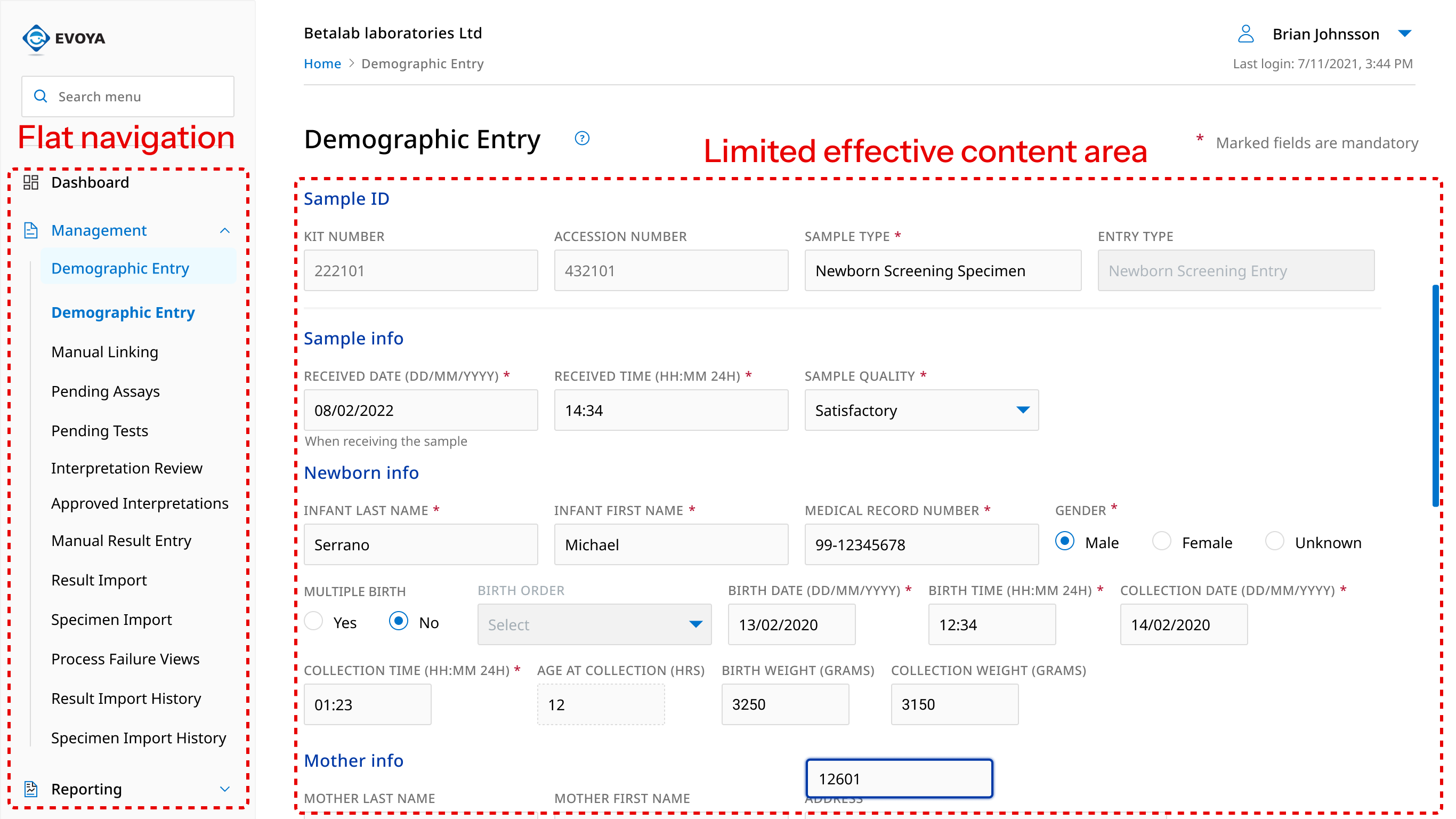
- Difficult to navigate between pages
- Unclear workflows to support
- Inefficient use of screen space for data-heavy tasks
The timing was particularly challenging: we needed to execute a complete rebrand due to organizational changes while simultaneously addressing fundamental usability issues. Lab technicians work in time-sensitive environments where every click matters, and any misstep in the redesign could impact patient care across dozens of facilities.
The Approach
I led two UX interns to transform both the visual identity and functional foundation of the platform. I structured the redesign as a phased implementation to manage risk while delivering value incrementally:
Phase 1: Research and Define
I began with a comprehensive heuristic evaluation and UX audit that revealed:
- Difficult navigation
- Unclear workflows due to unorganized page hierarchy
- Insufficient content area limiting row visibility in data-heavy screens
To establish optimal information architecture, I conducted a card sorting activity with 10 internal stakeholders, asking them to categorize pages and explain their reasoning. Analysis led to a clear solution: organize navigation to follow lab workflow stages.
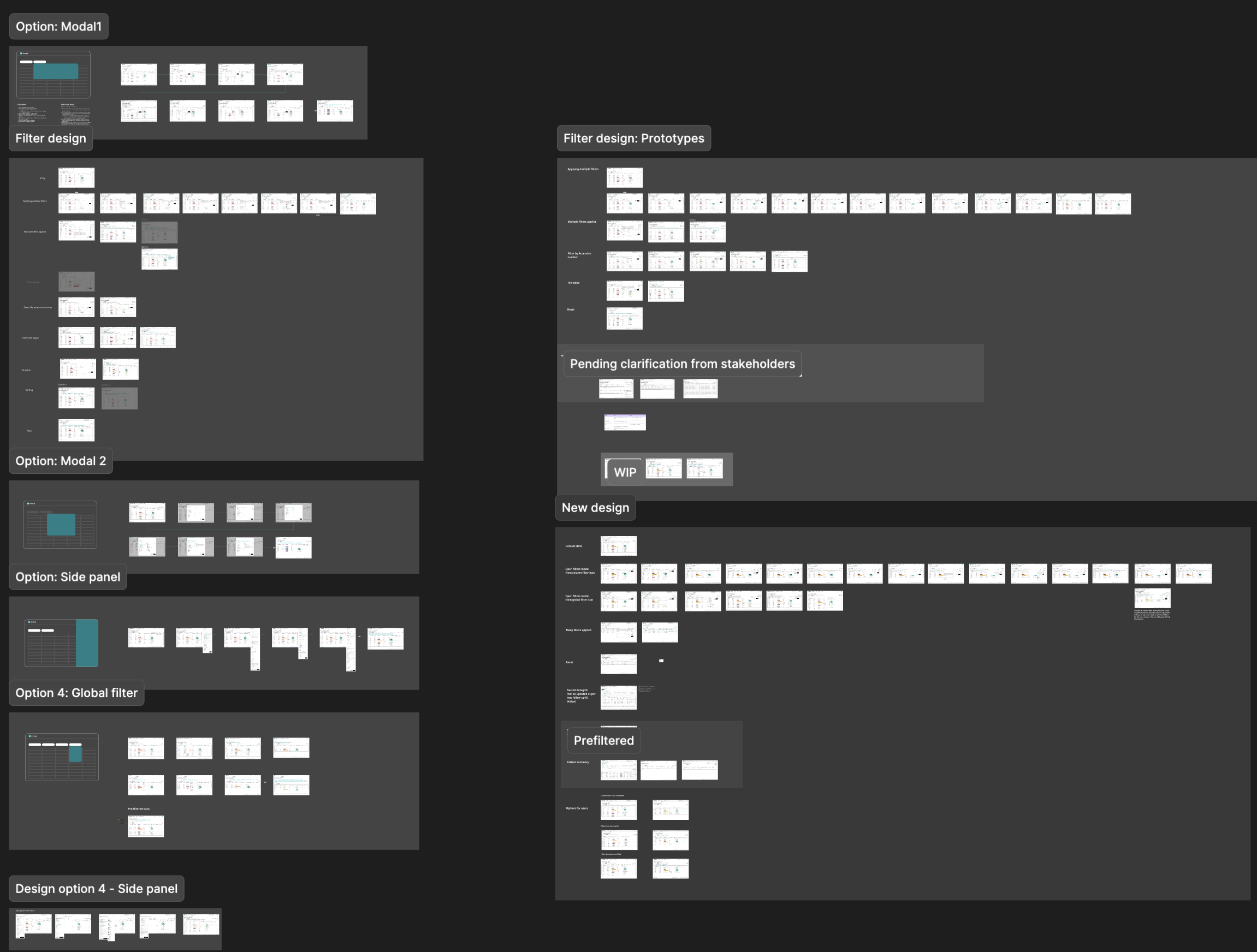
Phase 2: Design & Iterate
We designed iteratively and tested changes systematically, comparing old versus new designs. I worked closely with the engineering team to ensure technical feasibility while maintaining design integrity. The collaboration with UX interns allowed us to explore multiple directions simultaneously.
Phase 3: Validate & Implementation
Through usability testing and accessibility tests, we confirmed our solutions met goals.
This required extensive work, both updating design files in Figma and coordinating developer implementation through unit and manual tests. I established clear handoff structures to ensure quality throughout. And together with developers, we planed the solution rollout in 3 phases:
- Update design styles, small components and assets like logo
- Upgrade the whole layout to new solution
- Upgrade core and big components
The Solution
The redesign addressed multiple layers of complexity, would scale to hold the planned five-year feature roadmap.
- Designed intuitive navigation that reduced cognitive load in high-pressure environments
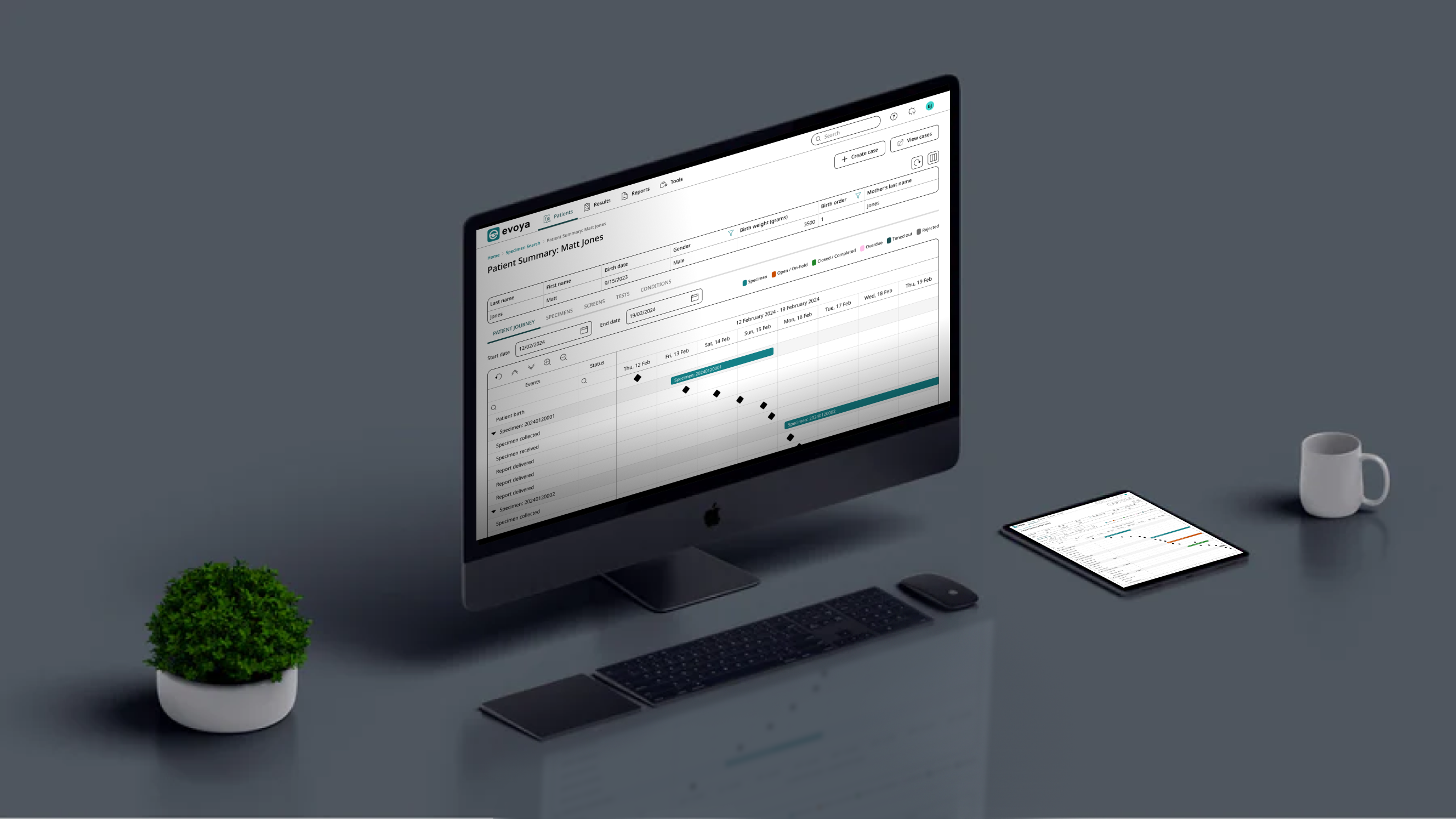
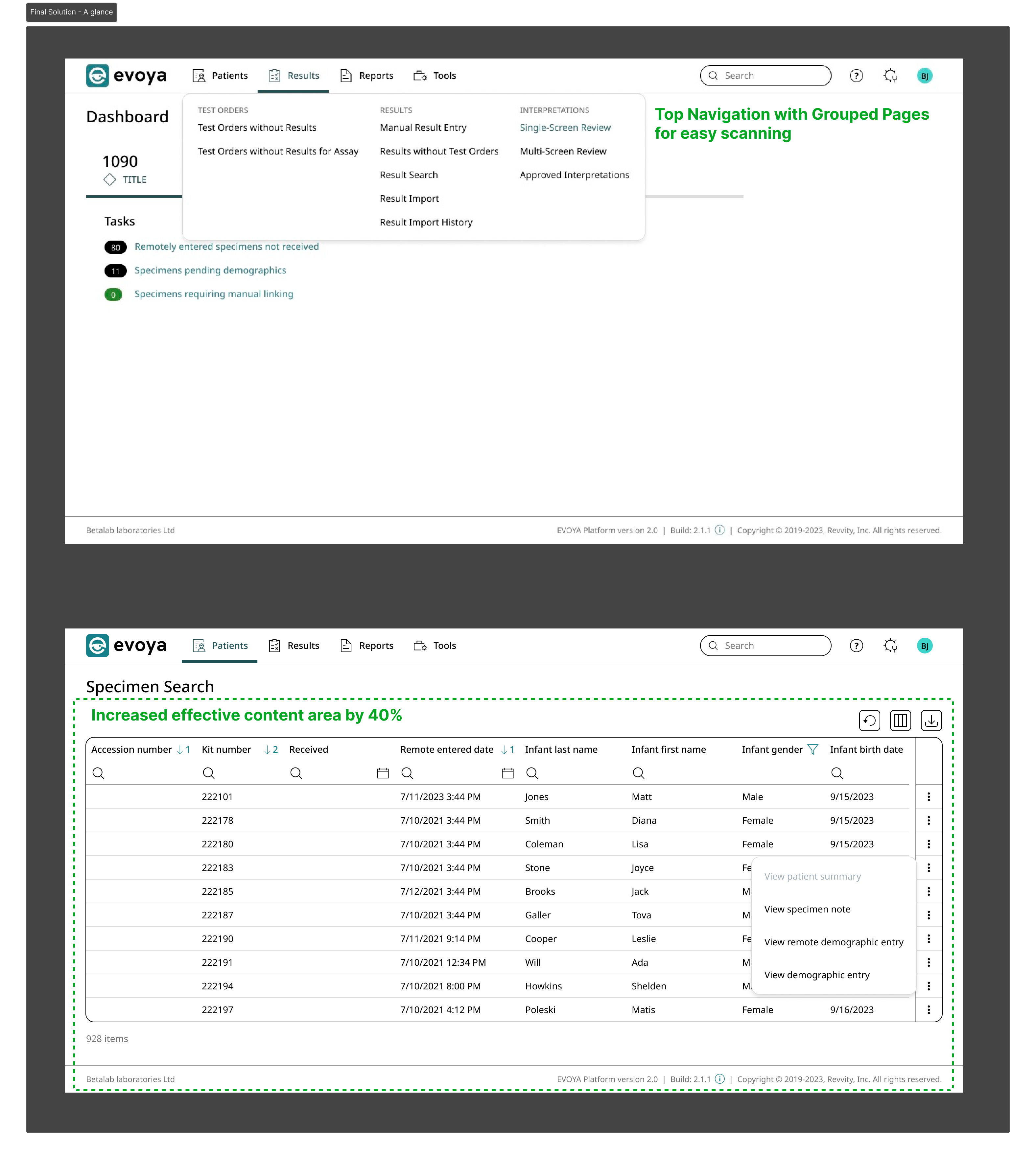
- Reorganized page hierarchy based on user mental models from card sorting, with new IA using top-navigation and dynamic breadcrumbs
- Increased effective content area by 40%, giving lab technicians significantly more space to view and process data
- Created cohesive visual system with new brand colors while ensuring WCAG accessibility compliance
Beyond aesthetics, we resolved substantial usability debt that had accumulated over years of rapid feature additions. This created a stable foundation supporting future mobile app development and diagnostic instrument integrations.
Impact and Results
The whole redesign delivered within timeline in 2 releases, and exceeded initial goals:
- 30% increase in effective content area = fewer scrolling actions and faster data review
- Improved data visibility = lab technicians could see more patient records at once, reducing time to locate specimens or identify anomalies
- WCAG accessibility compliance = opened opportunities in markets with strict healthcare regulations
- Scalable design system = faster feature development and reduced design/development time for subsequent releases
- Modern, user-centric positioning = competitive advantage in the SaaS market
Building Relationships Through Field Research
After the successful redesign, we had modernized the interface and existing experience. But I knew we were missing something crucial. Our understanding of user workflows was based primarily on stakeholder interviews and analytics. To truly serve lab professionals, I needed to see them in action.
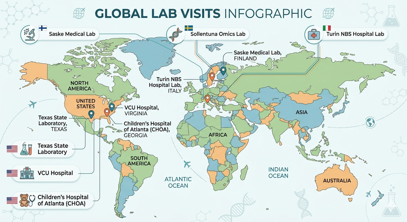
I advocated for comprehensive field research, making the case that direct observation would reveal insights impossible to capture remotely. After securing approval and building relationships with customer success teams, I coordinated site visits to five major customers across different market segments and geographies.
The Approach
We designed a structured research protocol that would maximize learning while respecting the high-pressure clinical environments:
- Pre-visit preparation: Collaborated with sales and customer success teams to identify diverse lab types (public health, hospital-based, reference labs) and secure access
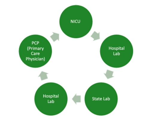
- Contextual inquiry: Observed nurses and lab technicians in their actual work environments, asking questions without disrupting critical workflows
- Workflow mapping: Documented end-to-end processes, capturing pain points, workarounds, and moments of friction
- Gap analysis: Compared current system capabilities against observed needs to identify prioritization opportunities
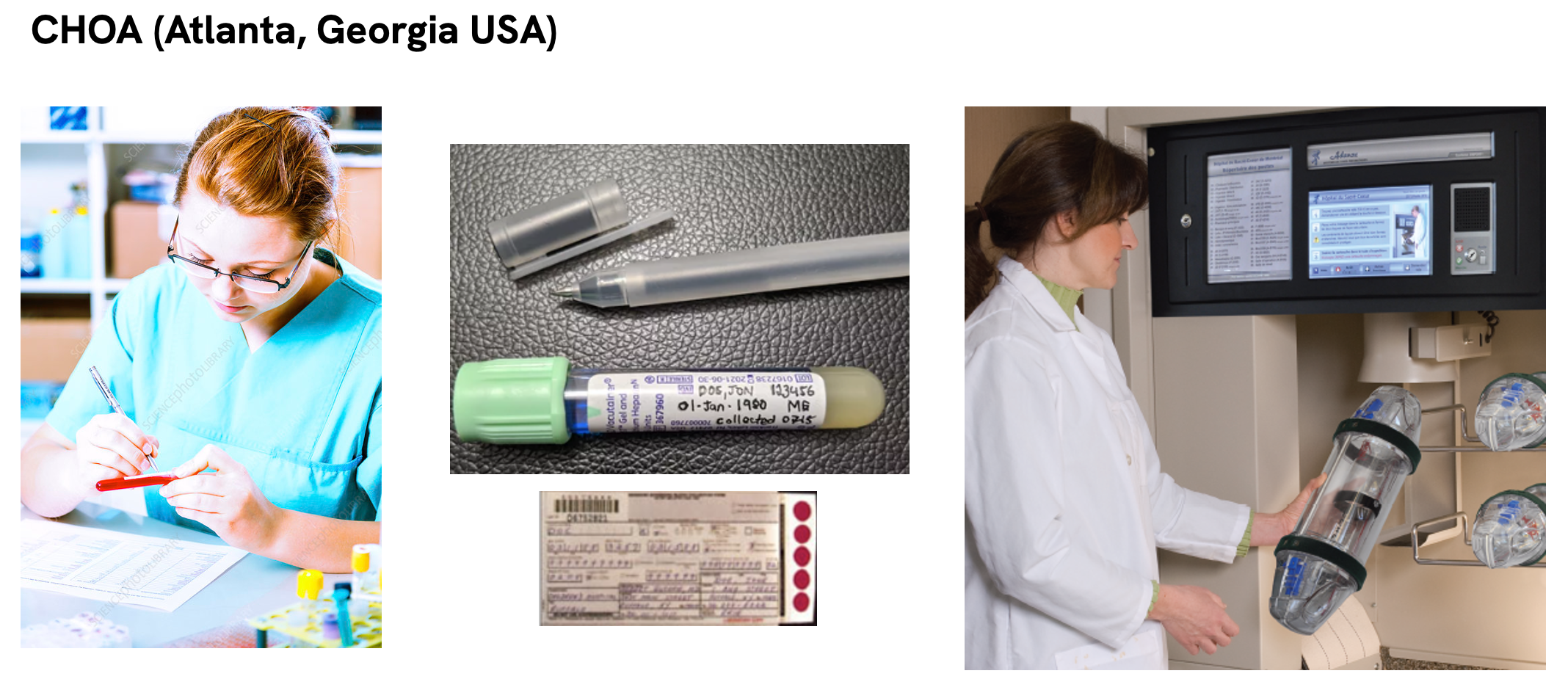
The visits spanned multiple countries and lab types: Saske Medical Lab in Finland, Sollentuna Omics Lab in Sweden, Turin NBS Hospital Lab in Italy, Texas State Laboratory, VCU Hospital in Virginia, and Children's Hospital of Atlanta (CHOA).
Key Insights
CHOA: Understanding the Ecosystem
Translating Research into Action
After each visit, I facilitated collaborative synthesis sessions with the product team.
We created detailed workflow maps, documented pain points with specific examples, and conducted gap analysis comparing current capabilities against observed needs.
These insights directly informed our roadmap prioritization:
- Printer connectivity and configuration persistence became high-priority infrastructure work
- Label printing workflows were redesigned to reduce steps and provide earlier error detection
- Universal search and improved naming conventions addressed navigation pain points
- Mobile-responsive design moved up the priority list based on COW usage patterns
Impact
The field research fundamentally shifted how we approached product development. Rather than building features based on stakeholder requests, we now had direct evidence of user needs in context. This enabled more confident prioritization and stronger stakeholder alignment around user-centered improvements.
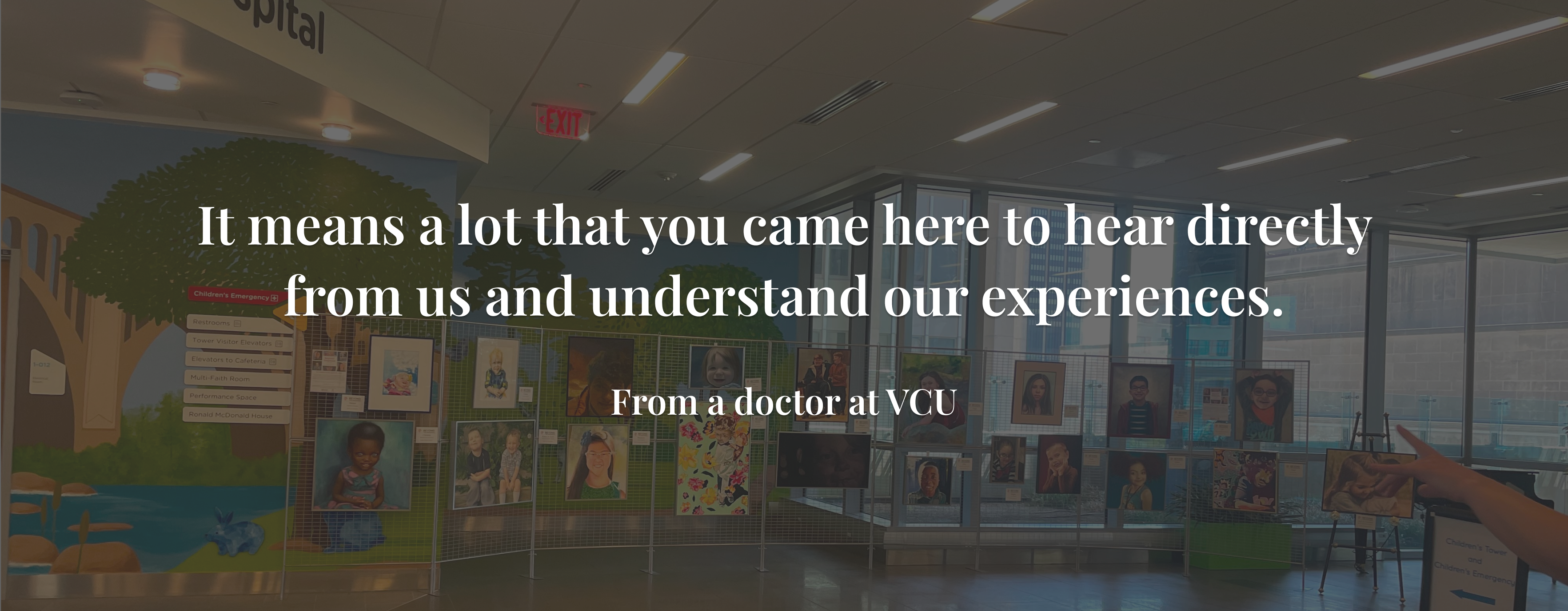
Beyond specific features, the visits strengthened customer relationships. Lab staff appreciated being heard, and our willingness to observe their work built trust that translated into more candid feedback and smoother future deployments.
Reflections
This project reinforced several lessons that shaped my approach to UX in complex systems:
- Starting with foundational research creates momentum. The heuristic evaluation and card sorting studies provided clear direction and stakeholder alignment from the beginning, enabling confident decision-making throughout the redesign.
- Phased implementation reduces risk while building stakeholder confidence. By demonstrating value incrementally, we secured buy-in for more ambitious improvements and established UX as a strategic partner rather than a service function.
- Field research reveals what analytics cannot. The site visits conducted after the redesign uncovered workflow inefficiencies and pain points that remote research would never capture. Watching nurses work with COWs at CHOA or seeing how printer failures cascaded into workflow delays at VCU provided insights that directly informed feature prioritization.
- DesignOps infrastructure pays dividends. The time invested in establishing file structures, design systems, and ways of working enabled the team to scale efficiently and maintain consistency across six scrum teams.
Enterprise software requires balancing multiple stakeholder needs. Lab technicians needed efficiency, administrators needed configurability, and the business needed a modern brand. Success required finding solutions that served all these needs without compromise.
Looking Forward
The Evoya redesign established a foundation that continues to support platform growth. The design system and processes we implemented enable the team to ship features faster while maintaining quality. The accessibility standards ensure the platform can serve diverse users across global markets.
Most importantly, the project demonstrated the value of combining strategic design with deep user research. By grounding the initial redesign in heuristic principles and card sorting, then validating and expanding our understanding through site visits, we created a platform that genuinely improves the daily work of lab professionals processing millions of specimens that impact patient care.
Tools & Methods
Let's talk
Working on something complex?
Good judgment, real problem, difficult environment — I'd like to hear about it.